Ended
Forms Ain't Formats
Jun 28 – Aug 10, 2019
Felix Becker, Fabian Hub, Frank Moll, Irina Ojovan, Yannick Riemer, Laura Sachs
Curated by Miriam Jesske
[Please scroll down for German version / Für Deutsch bitte scrollen Sie nach unten]
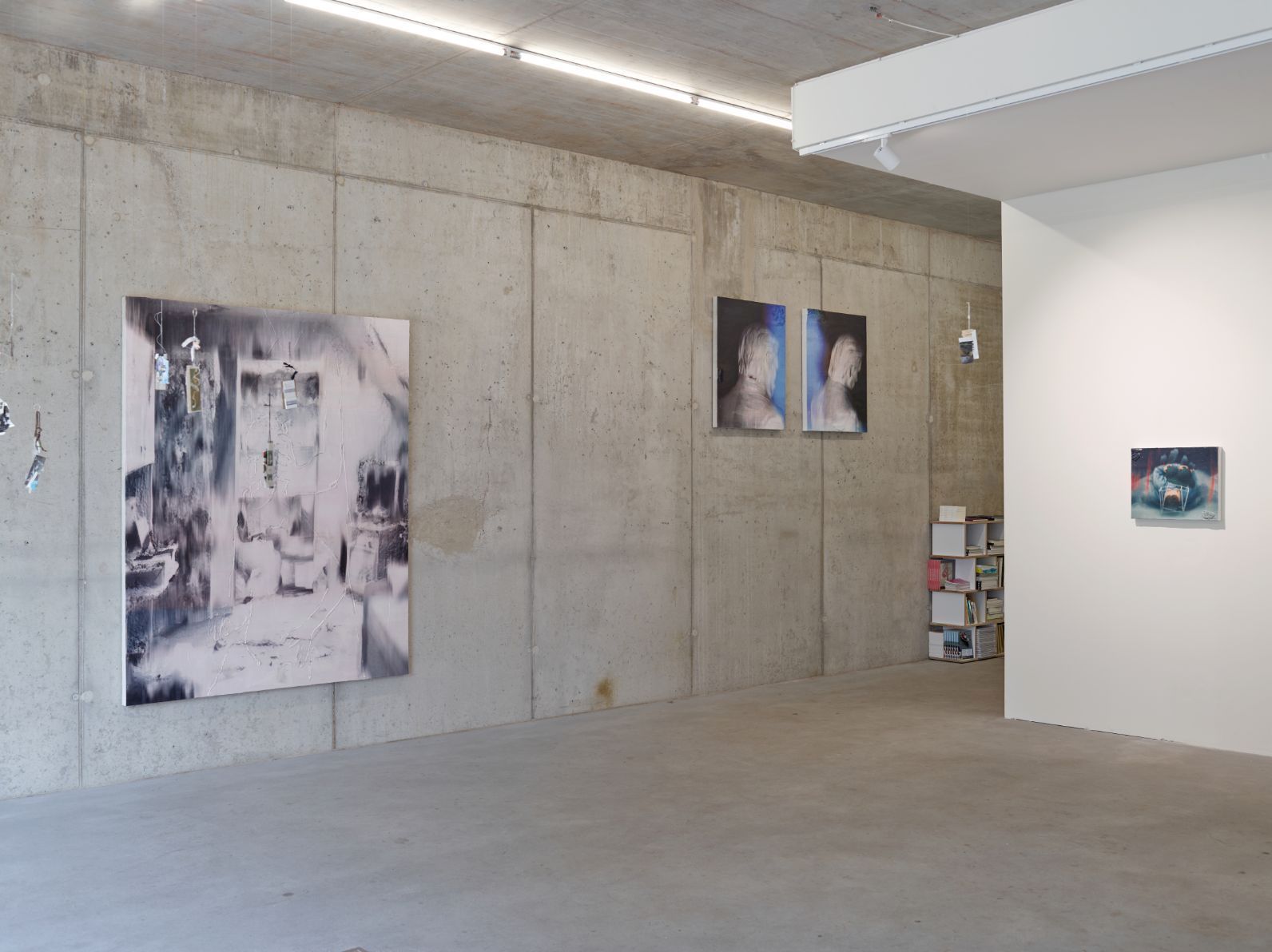
Loock Galerie is pleased to present six young artists in Berlin in the show Forms Ain't Formats. All six have in common that they use the canvas as support and at the same time as an object of artistic enquiry. The result are paintings that might also be interpreted as drawings, collages, reliefs, assemblages, or even sculptures. Noticeable is that all works are rooted in the medium of painting and a fundamental trust in its possibilities. The artists in this show also have in common that they either recently graduated from art school, or are about to graduate. And that they already have international experience with gallery shows, art fair presentations, or artist-in-residence programs.
Forms Ain't Formats presents selected works of these six artists to discuss various strategies of composition that use the material contingency of the support as an opposite - counterpart, antagonist - in the creative process. In the well-known terrain of the rectangular format, the six artists use different paths to create paintings, some with and some without figurative representations, that create an unusually high degree of narration and spatiality. The shapes and figures point beyond the limits of the format and establish direct contact with their immediate surroundings. The creation of the painting as a material object is always traceable. The viewer has the opportunity to continue the thought in a dialectics between material and painting.
For her visual compositions that are reduced to just a fewgeometrical planes, Irina Ojovandraws on personal memories and experiences that in turn are inspired by architectural, spatial areas, directions, shadows, light, and emotions. They are, as were, syntheses of memory worlds that transcend time that Ojovan transforms into abstract forms. In the exhibition, two paintings from the series "Sarmizegetusa" (started in 2016) that consists primarily of two monochrome black color fields of different quality, matt or shiny and reflective, this alone, it seems, allows Ojovan to demarcate the entire surface between background and foreground, transparency and opacity, between the ephemeral and the constant. For the artist, black stands both for silence and the invisible. So do these paintings show us as much as they don’t show us? The title refers to a bygone place, the military, religious and political center of the Dacians. Factual history, individual memories and a balancing of just a few plane pictorial elements - in this contested field, the material remains the object of the artistic exploration. Here, every color and every material opens emotional spaces and associative fields. Ojovan’s self-declared aim is to find and maintain a balance of given and withheld painterly information and beholding action.
Free fields of association can be found in the work of Laura Sachs. She treats the surface of the canvas on all sides. Some canvases are painted on the reverse side, until partially black areas seep through to the front side. Dust particles settle on the material during the process of painting and are integrated into the work’s genesis. Are they overexposed filmstrips from a decade long gone? Or worn cassette covers? A moonscape? The associations are decisively ruptured by a straight line running down vertically from the top of the painting. Is it a division between two different dimensions of painting, a la Barnett Newman? Probably not, because the line, as decisively as it is drawn, does not run all the way down to the lower edge of the canvas, but ends abruptly in the middle of the pictorial plane. In this way, Sachs opens up the format of the canvas with respect to the plane - reminiscent of Julije Knifer’s minimalist paintings, the black line, like a fissure lifts the plane canvas up and transforms it into a potential space. On the other hand, with Sachs, the black line turns out to be a metal rail which, heavy and accurate in contrast to the natural cotton material, seems to delimit the depth of the canvas, like the wall where it hangs.
Frank Moll emphasizes the canvas format by means of horizontal lines that are vertically interrupted and thus only really formed in the eye of the beholder. They are interrupted precisely at the same moment, so that lines and interruptions seem to follow an invisible trace. As a result, they seem to float in painterly space, or to be superimposed on the canvas as grids. Moll works in layers to bring forth the lines from the material of the paint, and to bring what has been covered back to the surface. The horizontal lines form partial wave-like shapes, leading to associations with frequency graphs from the fields of medicine and music. Moll’s "string paintings" could be in a wider sense understood as pulse-giving or composing painting. The original inspiration for them came from May Spils movie "Zur Sache, Schätzchen", where Martin, played by Werner Emke, represents his life as a row of crosses and strikes one out every day. "Angenommen ich werde 50" is the title of a triptych by Moll that quotes the figure of Martin and takes his logic of crossing out as an abstracted representation of lived time further. Lines as days of an entire human life? What could the wave shapes mean? That the days were shorter? More exciting? Or just that the food was worse?
The graphic representation of codifications and encryption systems is the matrix for the works of Yannick Riemer. By appropriating and transforming such codes and signs, the artist develops a network of cryptic fragments of language and symbols which he gradually condenses until they are hard - and indeed often impossible - to decode. The result is a world that invites us to venture interpretations, but never seems accessible. On paper or canvas, the different media, such as collage, drawing, painting, and silkscreen are superimposed on one another. The condensation of signs and symbols is continued beyond individual supports, by way of copying, enlarging, mirroring, transforming, printing, and reassembling these fragments. In his latest works, Riemer engages with pseudo-scientific theories that cast doubt on foundational positions and findings of the natural sciences. Cross-generational fears, the search for security, and the articulation of absurd worldviews become a thematic point of departure for new compositions and the expansion of Riemer’s sign vocabulary. For this, the artist uses old, discarded topographical maps as visual material that he cuts up and integrates into his dense and seemingly infinite universe of signs.
Once our gaze gets lost in the smoky, foggy cloud shapes, Fabian Hub’s pictorial space seems infinite. We can hold on to pictorial elements that are not decisively posited, but rather decisively worked out. The paintings are preceded by a long physical finding process that starts with initial lines and notes in charcoal which are directly placed on the canvas. Areas are painted over, erased, posited again, expanded, and articulated repeatedly. The artist collages with paper, photographs, painted remnants of canvas, and drawings, all of which, just like charcoal and paint, have to hold their own in the entire compositional process before pieces are ripped out again. If something belongs together after all, it is but pack together with surgical precision. Sometimes he uses the actual depth of the stretcher frame for a spatial arrangement of the pictorial fragments so that, just like with an assemblage, the three-dimensional quality of the canvas-painting is emphasized. What differentiates Hub’s painting from Robert Rauschenberg’s Combine Painting, however, is his concentration on the canvas format. While the overhang of material assemblages beyond the format into the exhibition space might also be interpreted as an expansive gesture, Hub’s gestures seem to embed themselves not just into the format, but also into the concept of painting as resonating body. We can sense here the artist interrogating his own intuition. What trace do I leave behind today? What thoughts are circulating in my head? And what of all of this might be still important tomorrow?
The physical process of composition also becomes apparent in Felix Becker’s paintings. His canvases carry a clear excess of paint from which he develops the paintings. The classic materials of pure linen fabric and oil paint as well as the chosen quantity of paint are an overemphasis of the subject as well as an overemphasis of the figurative that is material. However, we won’t find concrete figures in Becker’s paintings. Like everything else that is alluded to, they seem to hide in the paint, growing only through their three-dimensional form from the format into space. Becker is interested in colors that can best be defined in the interstices: greenish-blue, grey-pink, blackish-blue, reddish orange or minty white. The choice and blending of the paints as well as the size of the support are as it were the only premises of the picture’s genesis. When it is finished it might inspire specific imaginations. Becker only intends these to a limited degree. Instead, he wants the material to participate and make its own decisions. For his painting process, working with monochrome layers of paint that always cover the entire canvas like a relief is important. The negation of lower layers is part of the plan. We see a painting that has “grown” and lived through several states, structures of which remain partially visible or can be sensed. A painting, that is to say, which in a certain sense we cannot see or at least never fully grasp.
Forms Ain't Formats draws a line from concrete, constructed painting that manifests itself in certain materials to paintings that are only decided within a physical dialogue with the artistic means. So on the one hand we find in these works imagination that materializes itself, and on the other hand material that becomes imagination.
*****
Loock Galerie freut sich mit Forms Ain't Formats sechs junge Künstlerinnen und Künstler in Berlin vorzustellen. Allen sechs ist gemeinsam, die Leinwand als Bildträger und gleichzeitig als Gegenstand der künstlerischen Auseinandersetzung zu behandeln. Es entstehen Bilder, die ebenso gut als Zeichnungen, Collagen, Reliefs, Assemblagen oder sogar Skulpturen interpretiert werden können. Allseits anzumerken ist die Verankerung im Medium der Malerei und ein grundlegendes Vertrauen in ihre Möglichkeiten. Die Ausstellenden haben außerdem gemein, dass sie ihr Studium kürzlich beendet haben oder kurz vor dem Abschluss stehen und bereits internationale Erfahrungen in Galerieausstellungen, Messebeteiligungen oder Artist-in-Residence-Programmen vorweisen können.
Forms Ain't Formats zeigt ausgewählte Arbeiten dieser sechs künstlerischen Positionen, um verschiedene Strategien einer Bildfindung zu diskutieren, welche die materielle Bedingtheit des Bildträgers als Gegenspieler – Widerpart, Counterpart, Antagonist – im Schaffensprozess nutzen. Im wohlbekannten Terrain des rechteckigen Bildformats kommen die sechs auf verschiedenen Wegen zu Bildern, die, ob mit oder ohne Bemühung von figurativen Darstellungen, ein ungewöhnlich hohes Maß an Narration und Räumlichkeit erzeugen. Die Formen und Figuren weisen über das Bildformat hinaus und treten in Kontakt mit ihrer unmittelbaren Umgebung. Dabei bleibt die Schaffung des Bildes als materielles Objekt stets nachvollziehbar. Es besteht die Möglichkeit das Gegebene weiterzudenken, in der Dialektik zwischen Material und Bild.
Irina Ojovan schöpft ihre auf wenige geometrische Flächen reduzierten Bildkompositionen aus persönlichen Erinnerungen und Erfahrungen, die sich wiederum aus architektonisch, räumlichen Partien, Richtungen, Schatten, Licht und emotionalen Empfindungen nähren. Es sind gewissermaßen Synthesen zeitübergreifender Erinnerungswelten, die Ojovan in abstrakte Formen übersetzt. Die Ausstellung zeigt zwei Malereien aus der Serie "Sarmizegetusa" (seit 2016), die primär aus zwei schwarzmonochromen Farbflächen unterschiedlicher Qualität, matt oder glänzend spiegelnd, bestehen. Allein dadurch scheint Ojovan die gesamte Fläche zwischen Hintergrund und Vordergrund, zwischen Transparenz und Undurchlässigkeit, zwischen dem Ephemeren und dem Beständigen abzustecken. Für die Künstlerin steht Schwarz sowohl für die Stille als auch für das Unsichtbare. Zeigen diese Bilder demnach soviel, wie sie uns nicht zeigen? Der Titel bezieht sich auf einen vergangenen Ort, das militärische, religiöse und politische Zentrum der Daker. Tatsächliche Geschichte, individuelle Erinnerungen und ein bis zur Perfektion getriebenes Austarieren weniger flächiger Bildelemente – in diesem Spannungsfeld bleibt das Material der Gegenstand der künstlerischen Auseinandersetzung. Dabei öffnet jede Farbe und jedes Material eigene Emotionsräume und Assoziationsfelder. Ojovans erklärtes Ziel ist das Gleichgewicht zwischen gegebener und vorenthaltener malerischer Information und Betrachtungs-Aktion zu finden und zu halten.
Freie Assoziationsflächen finden wir bei den Arbeiten von Laura Sachs. Sie bearbeitet die Oberfläche der Leinwand von allen Seiten: Bei einigen Leinwänden wird die Farbe von hinten durch den Stoff gemalt, bis sich partiell schwarze Bereiche auf der Vorderseite durchdrücken. Staubspuren setzen sich während des Mal- und Bearbeitungsprozess auf dem Stoff ab und werden in das Entstehen des Werkes eingebunden. Sind es überbelichtete Filmstreifen aus einem weit entfernten Jahrzehnt? Oder abgenutzte Kassettendeckel? Eine Mondlandschaft? Die Assoziationen werden durch einen geraden Streifen, der von der oberen Bildkante senkrecht hinunterläuft, entschieden gebrochen. Handelt es sich um eine Barnett Newman’sche Grenzziehung zwischen zwei unterschiedlichen Malereidimensionen? Wohl kaum, denn der Streifen, so entschlossen er auch gesetzt ist, verläuft nicht konsequent bis zur unteren Leinwandkante, sondern endet abrupt inmitten der Bildfläche. Damit öffnet Sachs das Leinwandformat einerseits im Hinblick auf die Fläche – den minimalistischen Malereien Julije Knifers verwandt, hebt der schwarze Streifen, wie eine Kluft, die flächige Leinwand heraus und verwandelt sie in potentiellen Raum. Andererseits stellt sich bei Sachs der schwarze Streifen als Metallleiste heraus, die skulpturenhaft, schwer und akkurat im Kontrast zu dem natürlichen Baumwollstoff die Tiefe der Leinwand gleichermaßen zu begrenzen scheint, wie die Wand, an der sie hängt.
Frank Moll betont das Leinwandformat durch horizontal verlaufende Streifen, die durch dicht aufeinanderfolgende, vertikale Unterbrechungen erst in unserem Auge geformt werden. Akribisch genau setzen sie an den gleichen Stellen aus, sodass Streifen wie Unterbrechungen einer unsichtbaren Spur zu folgen scheinen. Dabei entsteht der Eindruck, als schwebten sie im malerischen Raum oder lägen wie Gitter auf der Leinwand. Moll arbeitet gezielt in Schichten, um Streifen und Striche aus dem Material der Farbe herauszuarbeiten und um Verdecktes wieder an die Oberfläche zu bringen. Die horizontalen Streifen beschreiben partiell wellenartige Formen, sodass Assoziationen an Frequenzgrafiken aus dem medizinischen oder musikalischen Bereich geweckt werden. Molls " string paintings" können in erweitertem Sinne also als pulsgebende oder komponierende Malerei verstanden werden. Ihre ursprüngliche Inspiration findet sich in May Spils Film "Zur Sache Schätzchen", in welchem Martin gespielt von Werner Emke sein Leben in Kreuzen aufreiht und jeden Tag eins durchstreicht. "Angenommen ich werde 50" ist der Titel eines Triptychons von Moll, das die Figur Martins zitiert und dessen Durchstreichlogik als abstrahierte Darstellung von gelebter Zeit weiterdenkt. Streifen als Tage eines ganzen Menschenlebens? Was könnten die Wellenformen bedeuten? Dass die Tage kürzer waren? Aufregender? Oder einfach nur das Essen schlechter?
Die grafische Darstellung von Kodierungen und Verschlüsselungssystemen ist der Nährboden für die Arbeiten von Yannick Riemer. Aus der Übernahme und Veränderung solcher Codes und Zeichen entwickelt der Künstler ein eigenes Netz aus kryptischen Sprach- und Symbolfragmenten, die er im Arbeitsprozess allmählich verdichtet, bis diese kaum oder gar nicht mehr entschlüsselt werden können. Es entsteht eine Welt, die vielerorts zur Interpretation einlädt, sich aber niemals zugänglich zeigt. Auf Papier oder Leinwand überlagern sich die gestalterischen Mittel, die bei Riemer bevorzugt in der Collage, Zeichnung, Malerei und dem Siebdruck zu finden sind. Die Verdichtung der Zeichen und Symbole setzt sich über die einzelnen Bildträger fort, indem die Fragmente kopiert, vergrößert, gespiegelt, transformiert, abgedruckt und neu zusammengesetzt werden. In seinen neusten Arbeiten beschäftigt sich Riemer mit pseudowissenschaftlichen Theorien, die grundlegende Standpunkte und Erkenntnisse der Wissenschaft anzweifeln. Generationsübergreifende Ängste, die Suche nach Sicherheit und die Formulierung absurder Weltbilder wird zum thematischen Ausgangspunkt für neue Kompositionen und der Erweiterung Riemers Zeichenvokabulars. Dazu benutzt der Künstler alte, ausrangierte, topografische Karten als Bildmaterial, die er zerschneidet und in seinen dichten, grenzenlos anmutenden Zeichenkosmos einfügt.
Sofern sich der Blick in den rauchigen, Nebelschwaden-artigen Wolkengebilden verirrt, scheint der Bildraum bei Fabian Hub unendlich zu sein. Halt geben Bildelemente, die nicht entschieden gesetzt, sondern entschieden herausgearbeitet sind. Den Bildern geht ein langer, physischer Findungsprozess voraus, der seinen Anfang in ersten Strichen und Notizen mit Zeichenkohle, die direkt auf der Leinwand platziert werden, hat. Immer wieder werden Partien übermalt, radiert, erneut gesetzt, erweitert und ausformuliert. Der Künstler collagiert mit Papier, Fotografien, bemalten Leinwandresten und Zeichnungen, die sich ebenso wie Kohle und Farbe im gesamten Bildfindungsprozess behaupten müssen und stückweise wieder herausgerissen werden. Wenn etwas doch zusammengehört, wird es in chirurgischer Diktion wieder aneinandergefügt. Bisweilen nutzt er die tatsächliche Tiefe des Keilrahmens für eine räumliche Anordnung der Bildfragmente, sodass, einer Assemblage gleich, die dreidimensionale Qualität des Leinwand-Bildes unterstützt wird. Was Hubs Malerei jedoch beispielsweise von den "Combine Paintings" Robert Rauschenbergs unterscheidet, ist dessen Konzentration auf das Leinwandformat. Während der Überhang von Materialassemblagen, aus dem Format heraus in den Ausstellungsraum hinein, als ausladende Geste gewertet werden kann, scheinen sich die Gesten Hubs, nicht nur in das Format, sondern in die Konzeption von Malerei als Resonanzkörper, einzubetten. Spürbar wird hier die Befragung der eigenen Intuition des Künstlers. Welche Spur hinterlasse ich heute? Welche Gedanken kreisen in meinem Kopf? Und was kann davon überhaupt morgen noch wichtig sein?
Der physische Prozess der Bildfindung tritt ebenso in den Malereien von Felix Becker hervor. Seine Leinwände tragen ein deutliches Übermaß an Farbe, aus dem er das Bild herausarbeitet. Die klassischen Materialien des reinen Leinenstoffs und der Ölfarbe, sowie die gewählte Menge der Farbe sind dabei eine Überbetonung des Sujets und eine Überbetonung des Figurativen, das Material ist. Konkrete Figuren allerdings suchen wir bei Becker vergeblich. Sie scheinen sich, wie alles andere, das sich andeutet, in der Farbe zu verstecken und nur durch ihre dreidimensionale Form aus dem Format in den Raum zu wachsen. Becker interessieren Farben, die sich nur in Zwischenbereichen definieren lassen: Grünblau, Graurosa, Schwarzblau, Rotorange oder Mintweiß. Die Wahl und die Anmischung der Farbe, sowie die Größe des Bildträgers sind gewissermaßen die einzigen Prämissen der Bildentstehung. Wenn es fertig ist, ruft es möglicherweise spezifische Imaginationen hervor. Doch Becker intendiert diese nur bedingt. Stattdessen sucht er die Mitsprache des Materials und dessen eigene Entscheidungsfindung. Bedeutsam für seinen Malprozess ist zudem das Arbeiten in monochromen Farbschichten, die reliefartig immer die ganze Leinwand überdecken. Damit ist auch die Verneinung von Darunterliegendem mitgedacht. Wir sehen ein „gewachsenes“ Bild, das mehrere Bildstadien durchlebt hat, von denen partiell noch Strukturen sichtbar oder spürbar bleiben. Ein Bild also, das wir in gewissem Sinne nicht sehen oder niemals vollständig erfassen können.
Forms Ain't Formats spannt einen Bogen zwischen konkreter, konstruierter Malerei, die sich gezielt in bestimmten Materialien manifestiert, hin zu Bildern, die erst innerhalb eines physischen Dialogs des Künstlers mit den gestalterischen Mitteln entschieden werden. Wir finden in den Arbeiten einerseits die Imagination, die sich materialisiert und andererseits das Material, das zu Imagination wird.
Kuratiert von Miriam Jesske