
Ended
The Man in the Three-Piece Suit
Mar 3 – Apr 9, 2023
Jesse Benson
Léo Chesneau
Daniel du Bern
Jeremy Gilbert-Rolfe
Gerold Miller
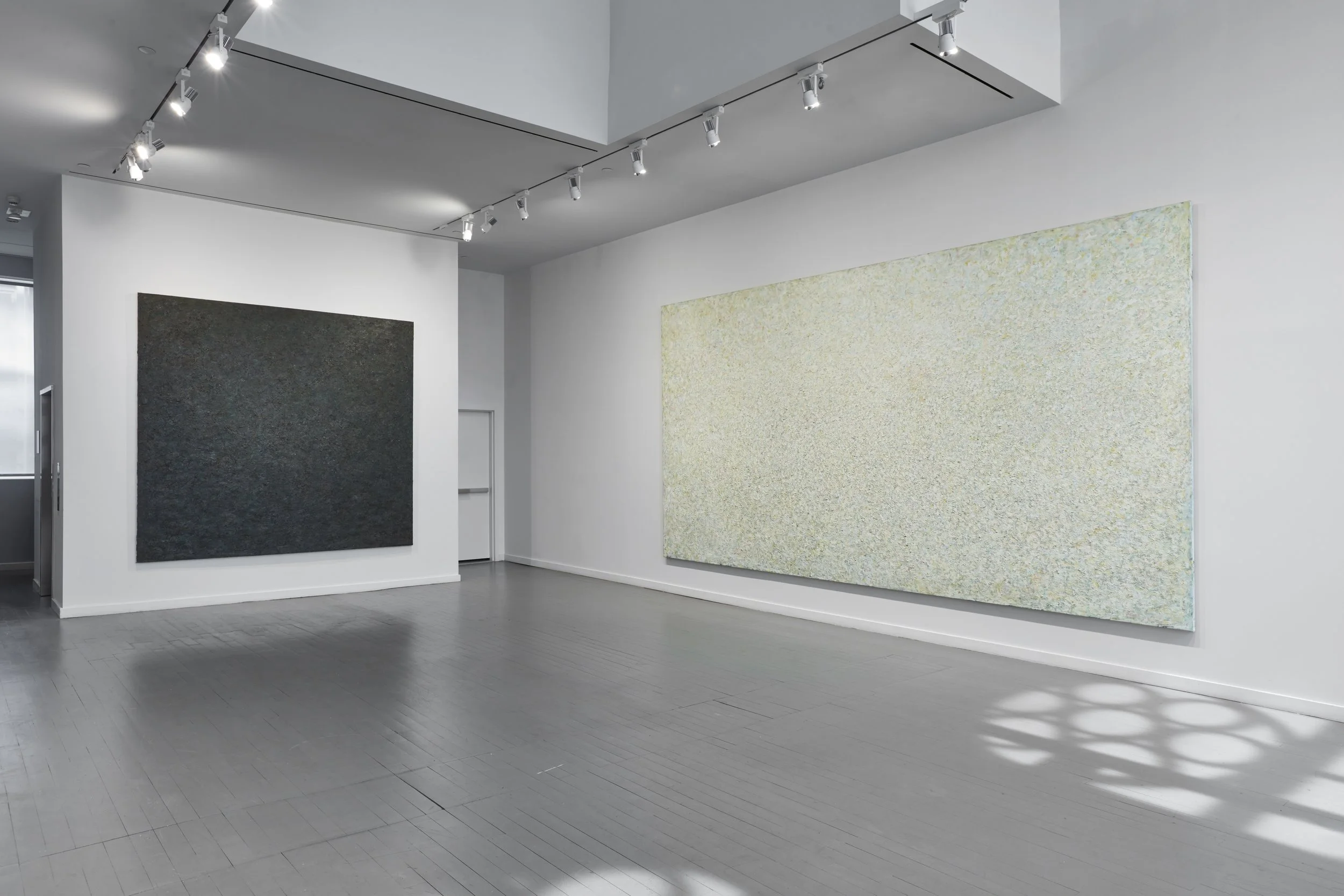
The Man in the Three-Piece Suit reconsiders geometric abstraction through the lenses of corporate aesthetics and the professionalization of art. Each painter uses materials that evoke the neutrality of office spaces, stock markets, and industrial production either through their materials’ literal use in those environments or through representation and formal evocation in the austerity of their designs. One also finds across the works in the exhibition a consistency of form and temperament that could be described as an aesthetic of professionalism. The paintings are designed to convince you of their authority as experts on themselves. And by extension the artists are working to convince you of their seriousness about their own ideas and craft through the abstract polish of their work. This is maybe a symptom of where capitalism has taken us, or in some sense a true expression of what painting has always been, having finally discovered itself beginning in the 1960s. Either way, this exhibition puts a spotlight on the relationship between an artist’s serious desire to convince through formal innovation and the viewer’s desire to believe in this conviction. The monolith of the black square, while completely devoid of the qualities one expects of a painting, and without becoming something else instead, nevertheless makes a compelling argument for its own existence and, let us not forget, its market value as well.
Jesse Benson’s diptych Compartmentalization Painting 9 (Correction) (2023) pulls together geometric abstraction and photographic realism into one composition depicting frantic activity in the stock market. Benson’s work is often research based and drawn from photographs: his recent Bureau Paintings representing the meeting of government agencies and art counterfeiters. The contrast between rigid asymmetry and the anatomical shapes of the figures brings the entire composition into abstraction while the figures create directional lines, their arms cascading as they signal trades to be made. But the human element still emerges when one looks into their faces for the particularity of each individual in his moment of intense focus. Then the picture suddenly terminates in the top right-hand corner of the scene where the figures dissolve into a cloud of abstract strokes cut short by the hard edge of an interior frame; their daily work blends together, this moment is like all others.
Léo Chesneau’s triptychs made with Xerox toner and colored office paper on wood panels, both Untitled (2022), are composed of the very materials that keep administrative output flowing. Their vertical streaks in CMYK draw the eye across a surface that is a continuous, seemingly machine-made topography. These squares of colored paper and toner appear to be like a glitch in the printer, or a test of some kind that reveals the workings of the printer mechanism. This flow is disrupted by rippling at the bottom edge, where one can see an index of exposed paper, the grid is disrupted, showing how the painting is actually made by pulling color across the painting’s surface.
Daniel du Bern’s Newspaper Work: The New York Times (02.24.23) (2023) is dated by using a newspaper from the day of its creation on February 24, 2023. The overlapping newspaper stories are the backdrop for a monochrome canvas colored a precise 18% gray which is used by photographers to check color and value accuracy against varying light conditions. By analogy, the painting begs a comparison with the neutrality of journalism, the practitioners of which aim for a more complicated accuracy in storytelling. Du Bern’s work stands as a kind of reflection on itself, and one wonders whether an analogy really exists between the neutrality possible with color and the neutrality of information. As the color bleeds over the side of the canvas to dissipate into a fuzzy edge it refers to other works in the exhibition, its formal uncertainty betrays the confidence of hard lines.
Jeremy Gilbert-Rolfe, critic, theorist, and a founding member of October magazine exemplifies the artist as professional. Part of the generation after the New York School that put forward painting as above all an intellectual endeavor, his paintings are meant to evoke sublime experience or its approximation—the lofty aims of unmediated experience. His painting Steel-Lined History (1988) does something to the viewer. From its black center one’s attention is pulled back and forth between the awareness of looking and unreflexive absorption in the details of the piece. Chromatically, this painting is unusual for Gilbert-Rolfe’s oeuvre, which has always focused on deep color as the main instigator of experience. Having a strong relationship to other works in the show, its very dark palette reenforces the linear rationality of capital in its chromophobia.
Gerold Miller’s diptych set 310 / set 311 (2016) made from automotive lacquer on stainless steel establishes a fairly direct reference to German industrial manufacturing. While its black surface might appear monochromatic, the contrasting reflectivity of the paint’s finish creates an optical illusion in the spirit of Josef Albers’ Homage to the Square series. Depending on where one stands, the surface appears to become one gray tone as it reflects the bare wall, before a body breaks this field by stepping into the more reflective area. The distinction between color and surface is collapsed by making the reflection of the wall a part of the painting. Incredibly sleek, its surface is intimidatingly modern.
—Nicholas Heskes